This project is part of HCDE 511 - Information Visualization, a graduate level course under UW's Human Centered Design and Engineering program. Taught by Professor Holger Kuehnle & PhD teaching assistant Brett Halperin.
A complete data visualization process was carried out over the course of ten weeks. First, we stared with the infrastructure and collisions data set from Seattle Open Data. We then cleaned, analyzed and created visualizations based on the aforementioned dataset. We also incorporated feedback from usability testing, and considerations from user research based on the feedback from our primary and secondary users.
We delivered a complete data visualization dashboard built with Tableau. Through research and usability testing, we validated our target users, confirmed our data story layout, and design for data visualizations. In addition, we generated then implemented design recommendations on types of data displayed, interface, and general improvements to the final data visualization dashboard.
Data Analysis & Visualization
Interaction Designer
Tableau
Mapbox
Seattle Open Data
10 weeks (Jan - Mar 2022)
Raf Laus,
Jennifer Spriggs,
Sierra Jenkins &
Aichen Sun
Data obtained from Seattle Open Data
I took on the responsibilities of obtaining data, preprocessing, analysis, visualizing data, contributing to user research via prototyping, and implemented changes from usability testing. I primarily analyzed quantitative, nominal, ordinal and geospatial data. I also built the dashboard using Tableau, and synthesized various maps from my collaborators. Details of my contributions are listed below.
User research planning, script writing, prototype, and implemented findings from user testing to final data visualizations & dashboard.
Cleaned the collisions dataset, exploratory data analysis, investigate data types for encoding / mapping, combined secondary datasets
Sketched initial concepts, data encoding, created visualizations, animation, data storytelling & final data visualization dashboard using Tableau.
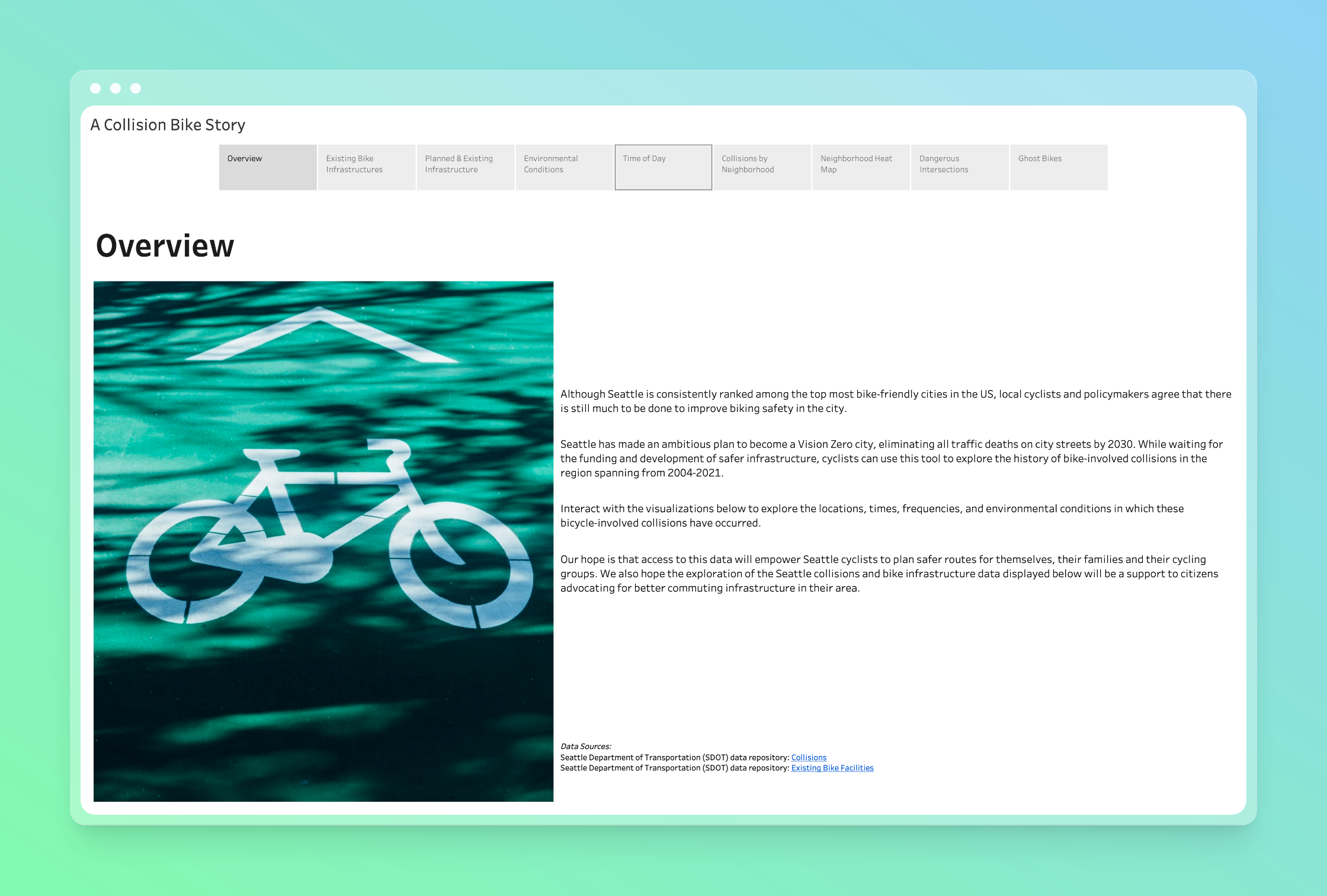
Seattle has made an ambitious plan to become a Vision Zero city, a multi-year initiative to eliminate all traffic deaths on city streets by the year 2030.
This project is an analysis of the biking environment that currently exists in the Seattle Metropolitan Area — particularly infrastructure, conditions, weather, the and other factors that cause serious accidents or injury.
interview
contextual inquiry
data wrangling
data preprocessing
data analysis
identify target users
define needs; pain points
frame specific user problem
initial sketches & solution
narrative for data story
dashbord layouts
click-through prototype
high fidelity prototype
usability testing
map + layout variations
final dashboard
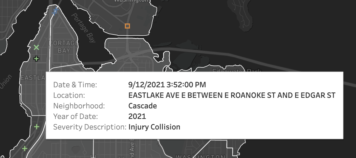
Seattle Open Data Collisions Dataset from the Seattle Department of Transportation (SDOT) Yearly auto, pedestrian and bike collisions from 2004 to 2021. Over 37 data dimensions from geospatial, nominal, ordinal, and quantitative data.
severity
date/time
# of vehicles involved
# of injuries
collision type
address type
weather
road conditions
light conditions
latitude & longitude
polygons for area boundaries (e.g. neighborhoods and cities)
lines (city streets)
points (addresses, incidents)
Problem Statement
Primary & Secondary Personas
Group ride leaders take special considerations, over and above what they would typically plan for themselves, when planning routes for rides involving larger groups of people. These routes tend to be designed with safety in mind while considering the volume of a group.
This data can be useful for the involved cyclist activist either individual or involved with an organization like Cascade Cycle Club, who is interested in influencing the city to prioritize building safer bike infrastructure in their communities.
Examine the dangers bikers face in certain conditions by highlighting instances and frequency of collisions and accidents involving bikes across the city.
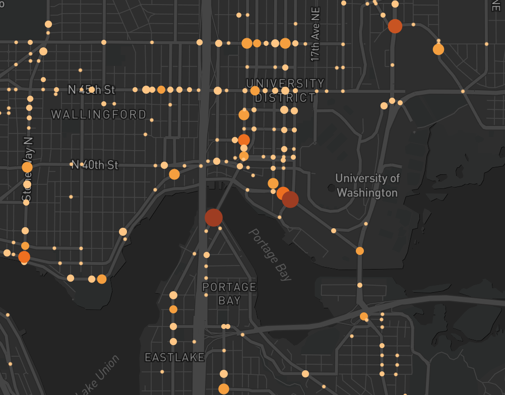
Study the existing bike infrastructure and its relationship to biking safety in Seattle — and how certain conditions contribute to dangerous cycling conditions.
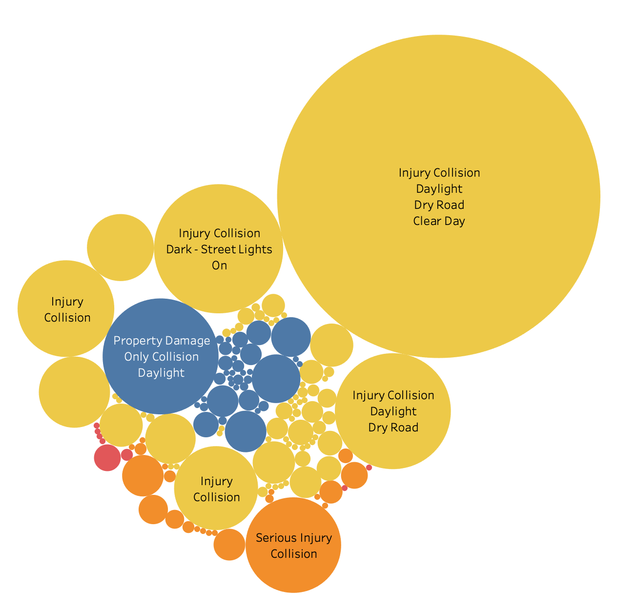
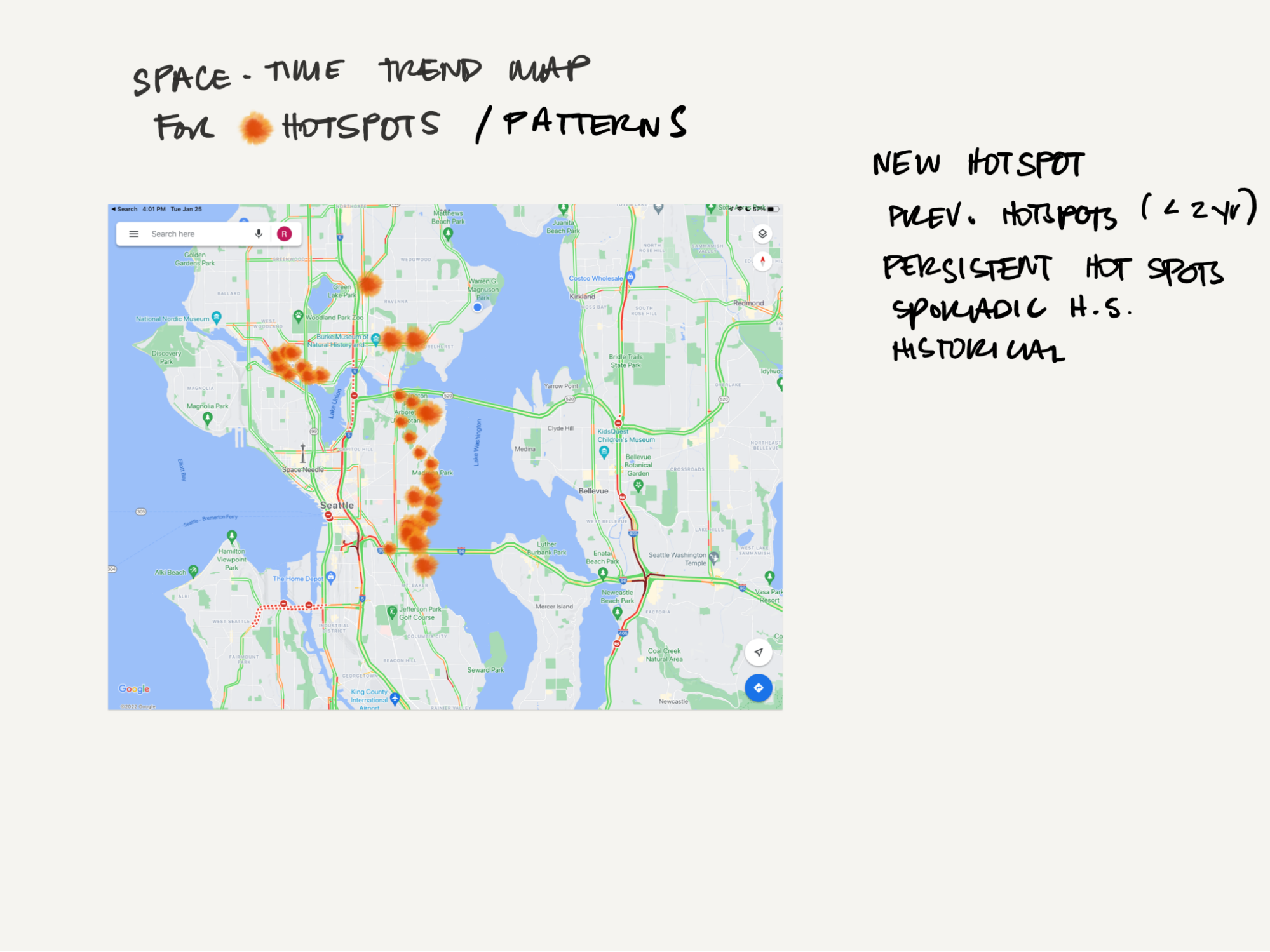
Where are the crashes present in the city?
What is the volume per location?
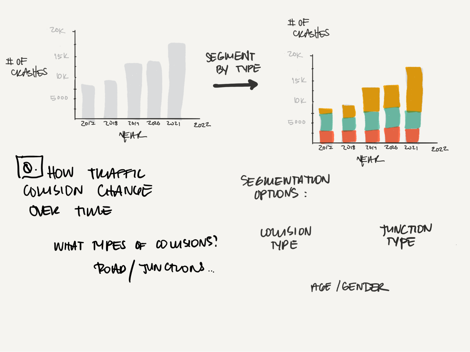
What years had the most crashes?
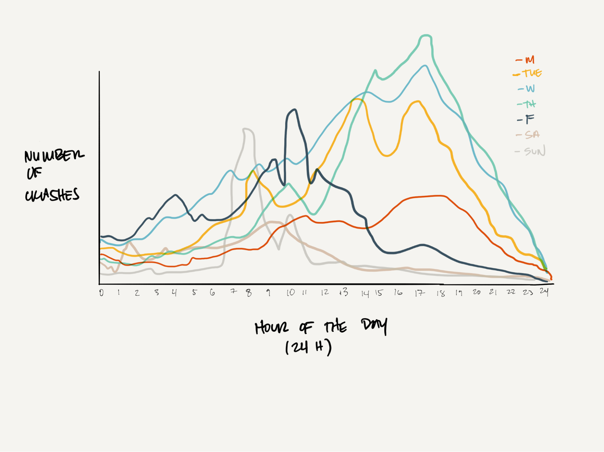
Do collisions spike at certain times of the day?
Does that change depending on the day?
The distribution of bike collisions the day BEFORE, and the day AFTER COVID.
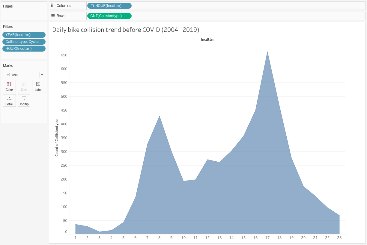
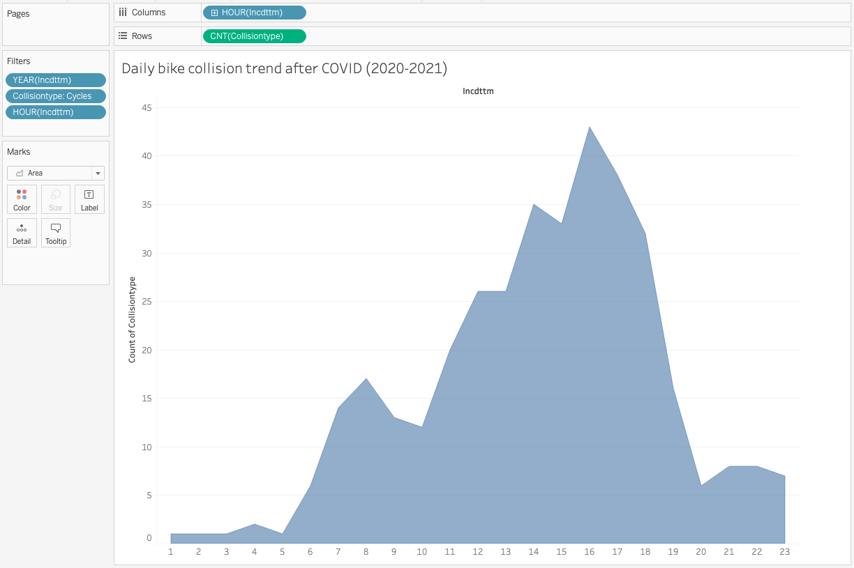
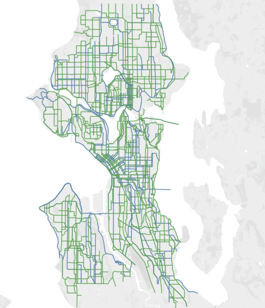
Combining our primary and secondary data sets
Narrowing in on the most relevant dimensions of our complex data
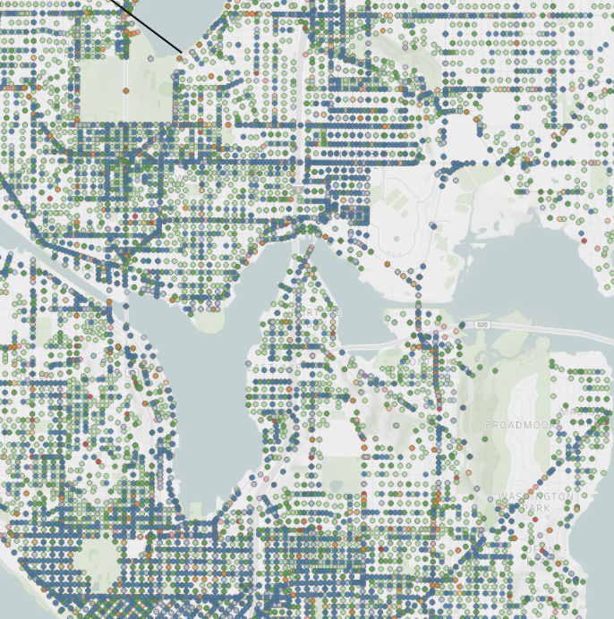
How much we can layer on a map before it’s incomprehensible, or cumbersome data-wise for the system?
Deliver
Tableau Story Format
User Feedback
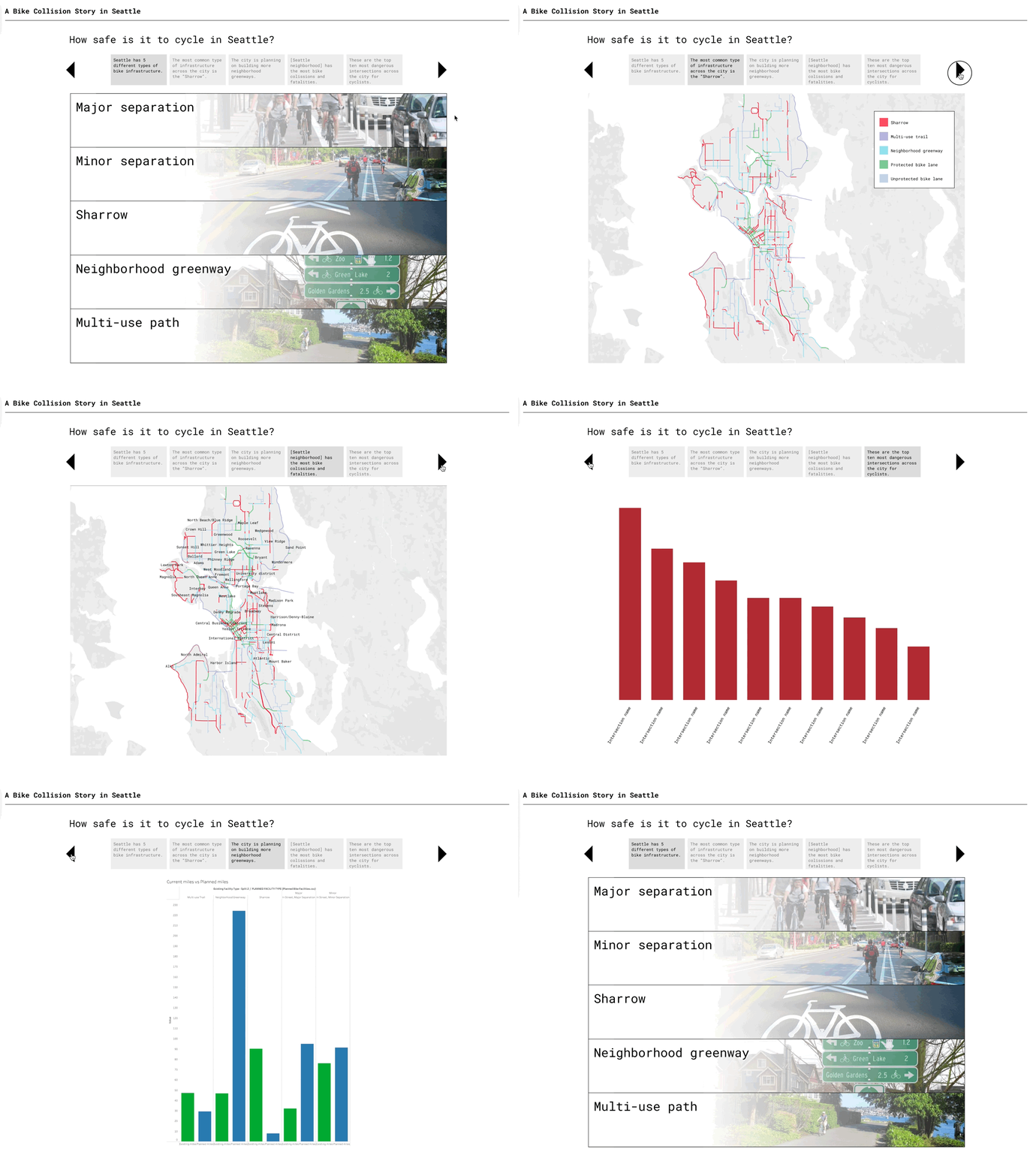

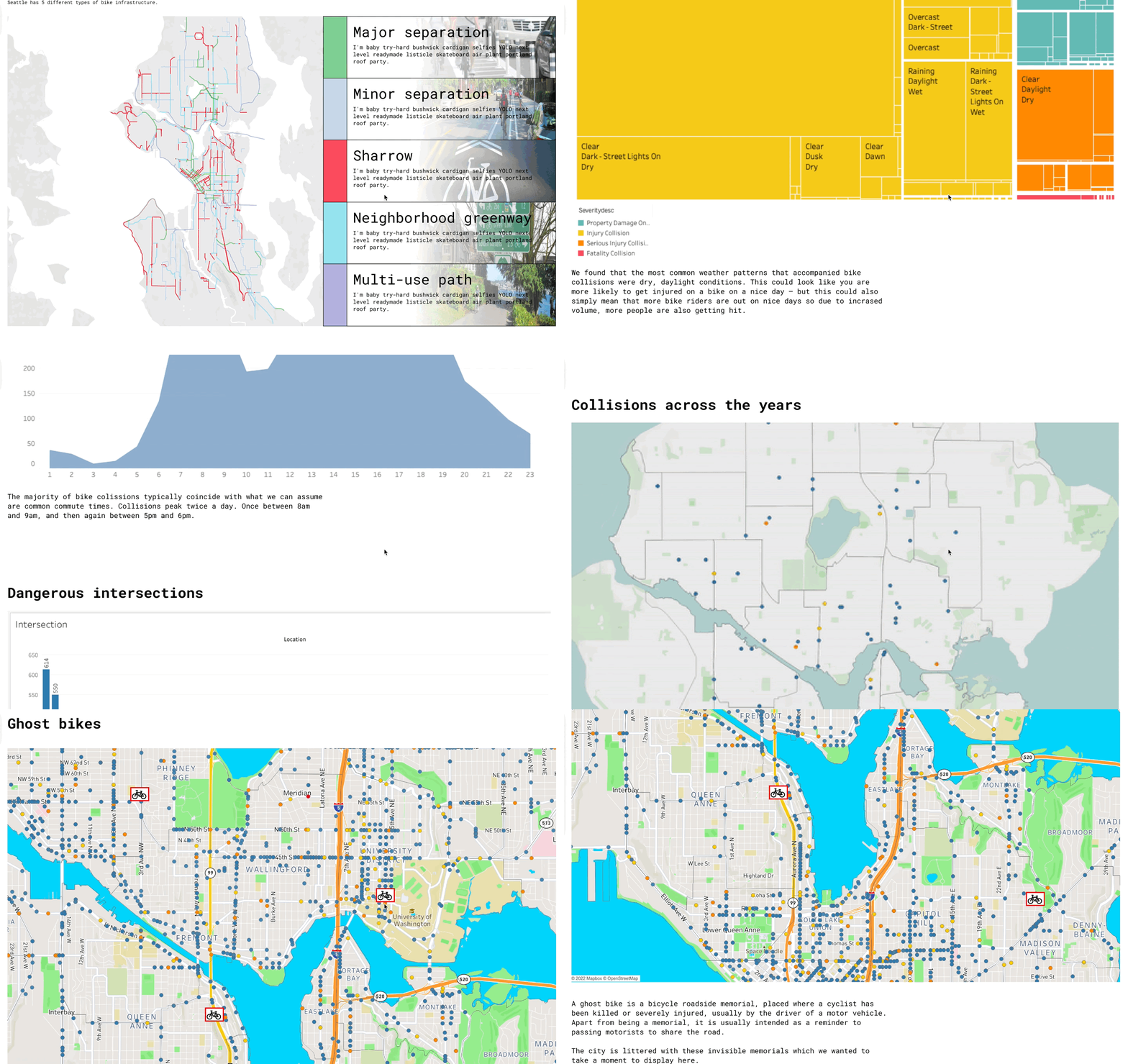
Tableau Editorial Format
User Feedback

my projects
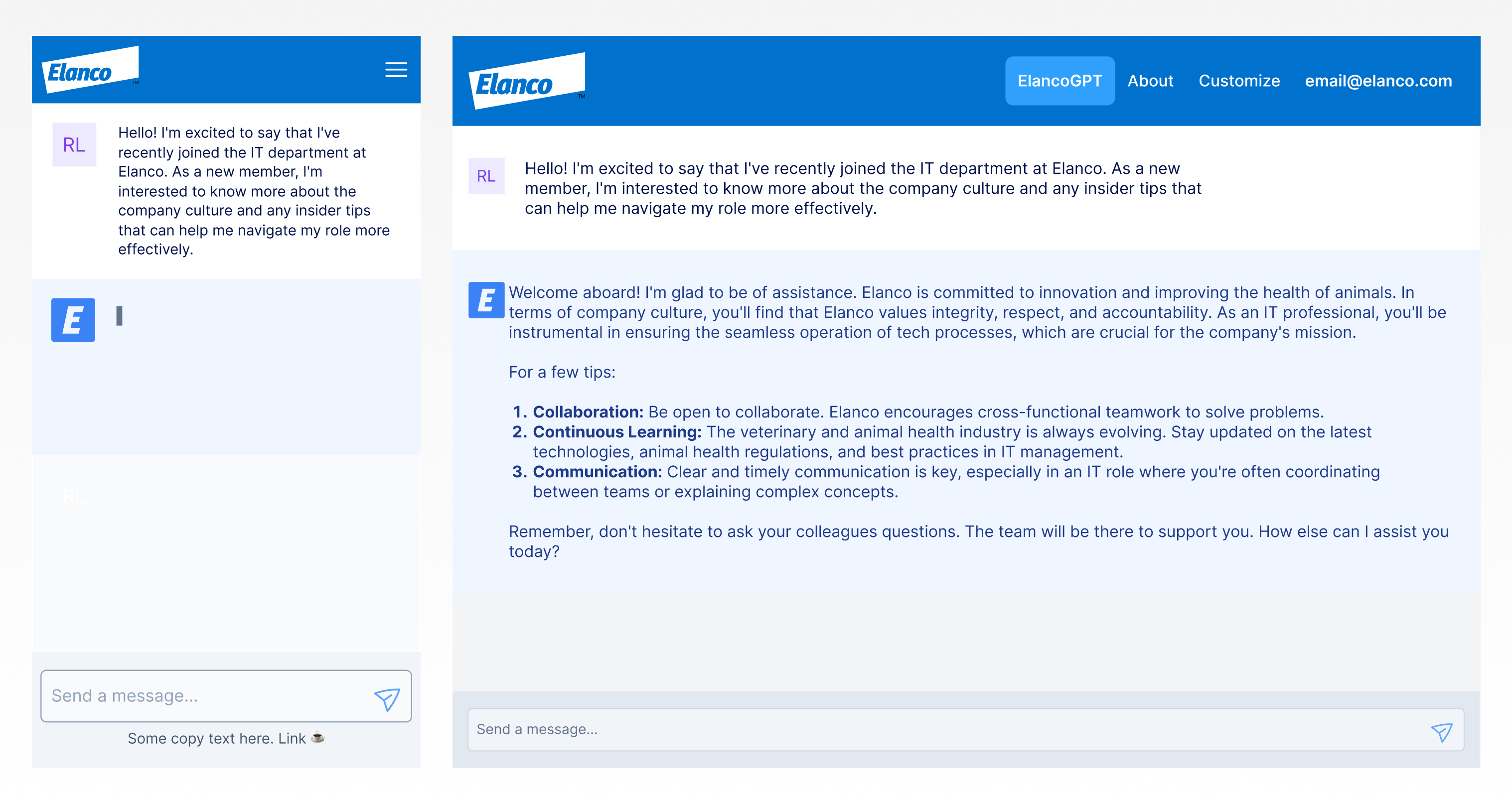
ElancoGPTML/AI, Design System, Enterprise, Decision Support, Zero to One
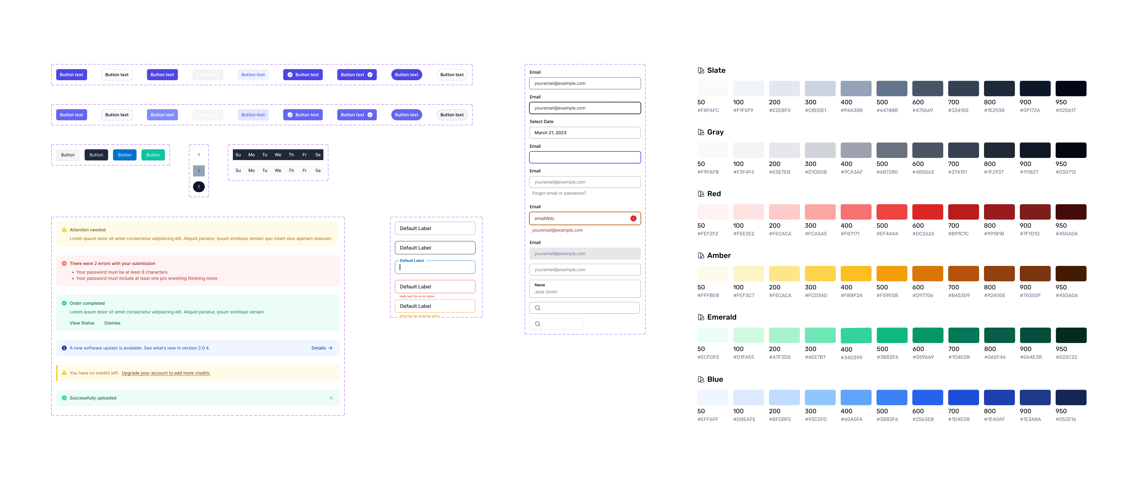
Elanco Component LibraryFoundational UI Elements, UI Framework, Corporate Branding, Style Guide

Continuous DiscoveryDiscovery, Generative, Evaluative Research, Problem / Solution Space, Process
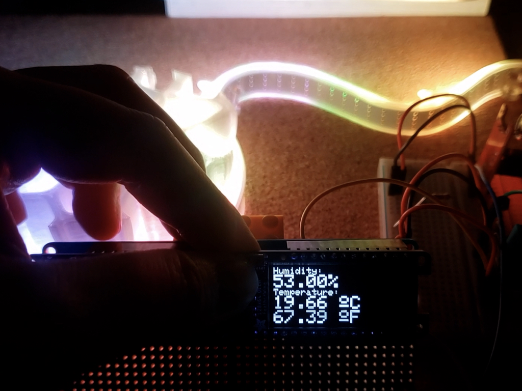
MossiPhysical Computing & Prototyping

OpenELISUX Research, Usability Testing, Lab Management Information System

CISCO NetAcad 20Education, UX/UI, Contract, B2B
PayPalE-commerce, Enterprise, Payments
Raf Laus, Portfolio. https://rlaus.xyz. © 2024